BIZZ makes a clean-formula nicotine gum that charges a premium and earns it. We built the immersive store that gives it presence to match, where a visitor feels the quality of the product long before they ever reach the ingredient list.
BIZZ makes a clean-formula nicotine gum that charges a premium and earns it. We built the immersive store that gives it presence to match, where a visitor feels the quality of the product long before they ever reach the ingredient list.
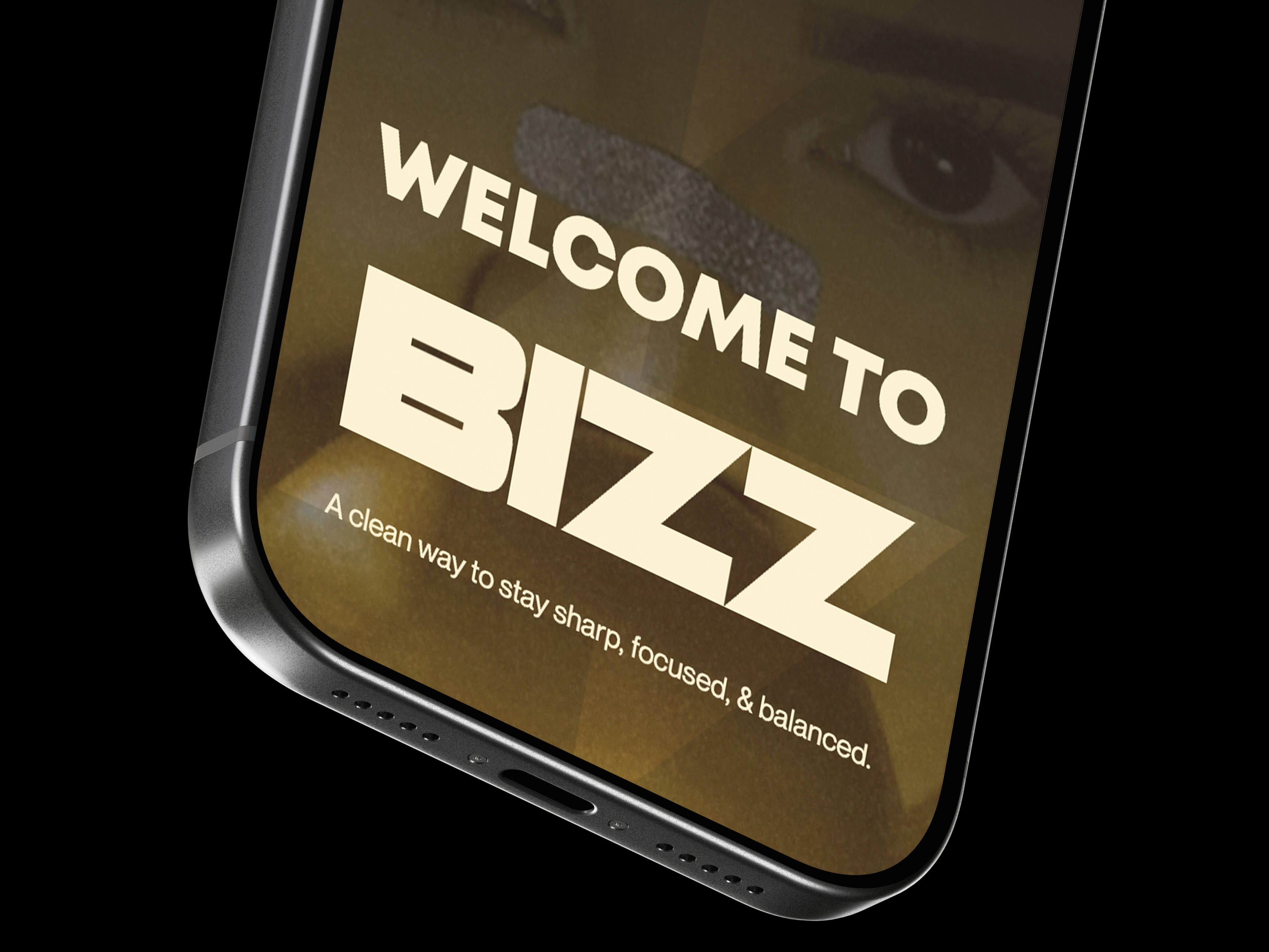
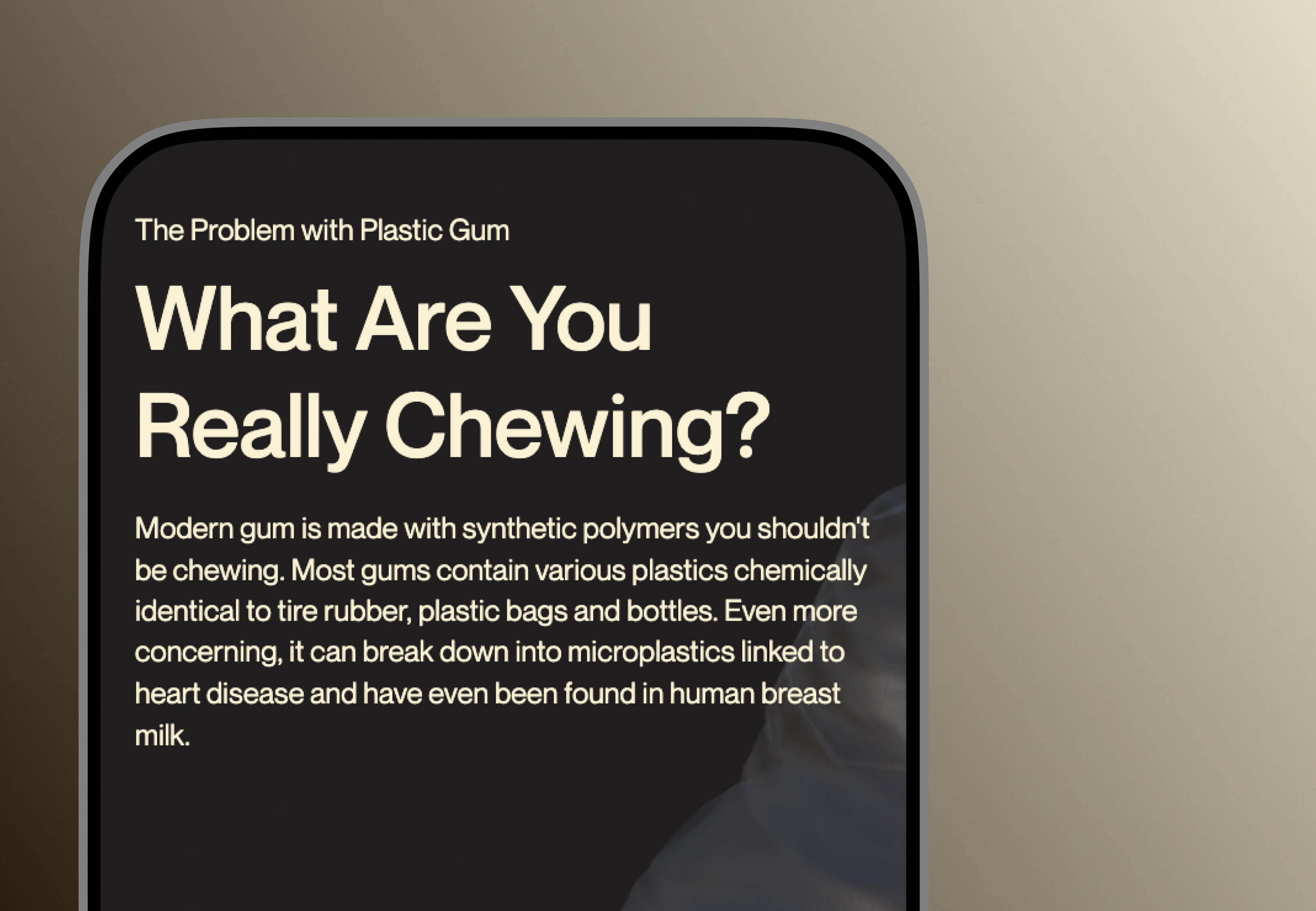
Walk the nicotine gum aisle and everything looks like medicine. Pharmaceutical packaging, the unspoken assumption that buyers only care whether it works. BIZZ wanted out of that aisle with a genuinely clean formula, no microplastics, no synthetic binders. Our brief was to make that difference land without drowning the page in ingredient lists and wellness platitudes.
So this was two problems wearing one coat. A design problem and a credibility problem. Buyers had to grasp what's wrong with conventional gum, see the formula's transparency for themselves, and feel both of those things inside an experience as premium as the product. A hero image over a feature grid would have sunk the positioning before the first sentence.
And there was a wall in the way. The standard Webflow-to-Shopify embed slaps a generic storefront template onto the page at checkout, which shatters the brand environment at the precise moment a buyer has decided to spend. Holding the experience together through that moment wasn't a nice-to-have. It was the commercial hinge of the whole build.
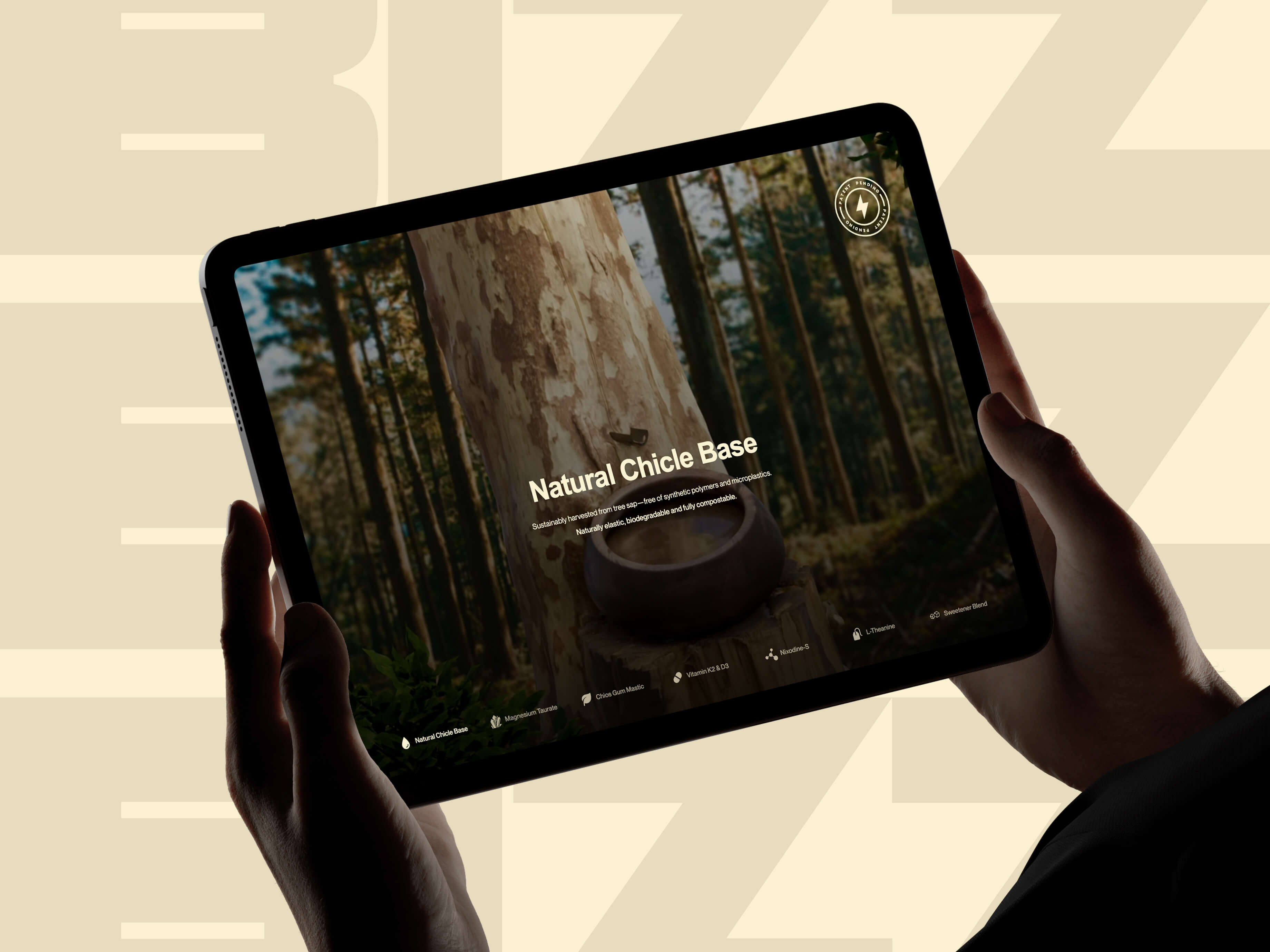
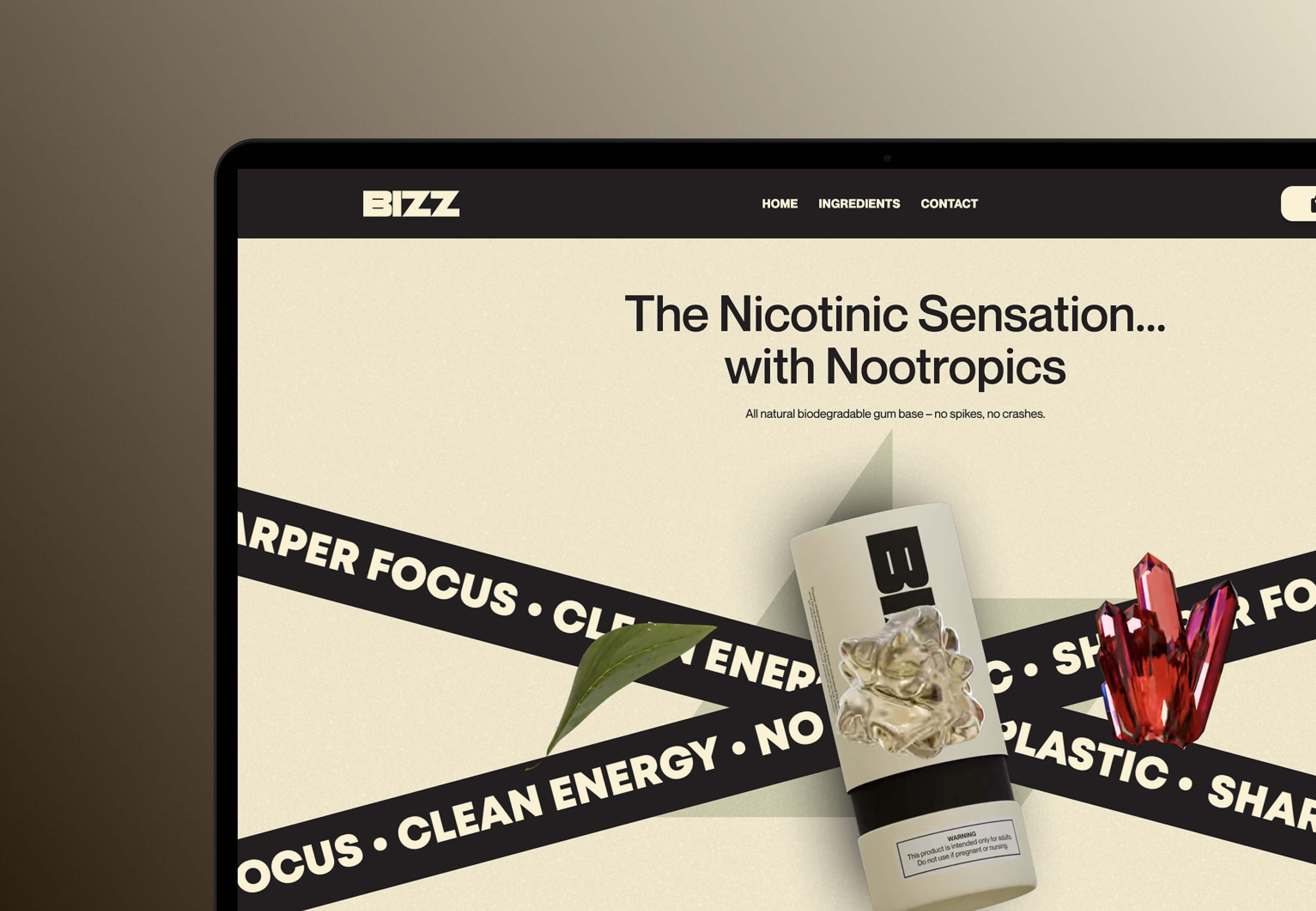
We settled one thing early. The site would not explain the product. It would let you feel the product first and understand it second. Everything grew from that.
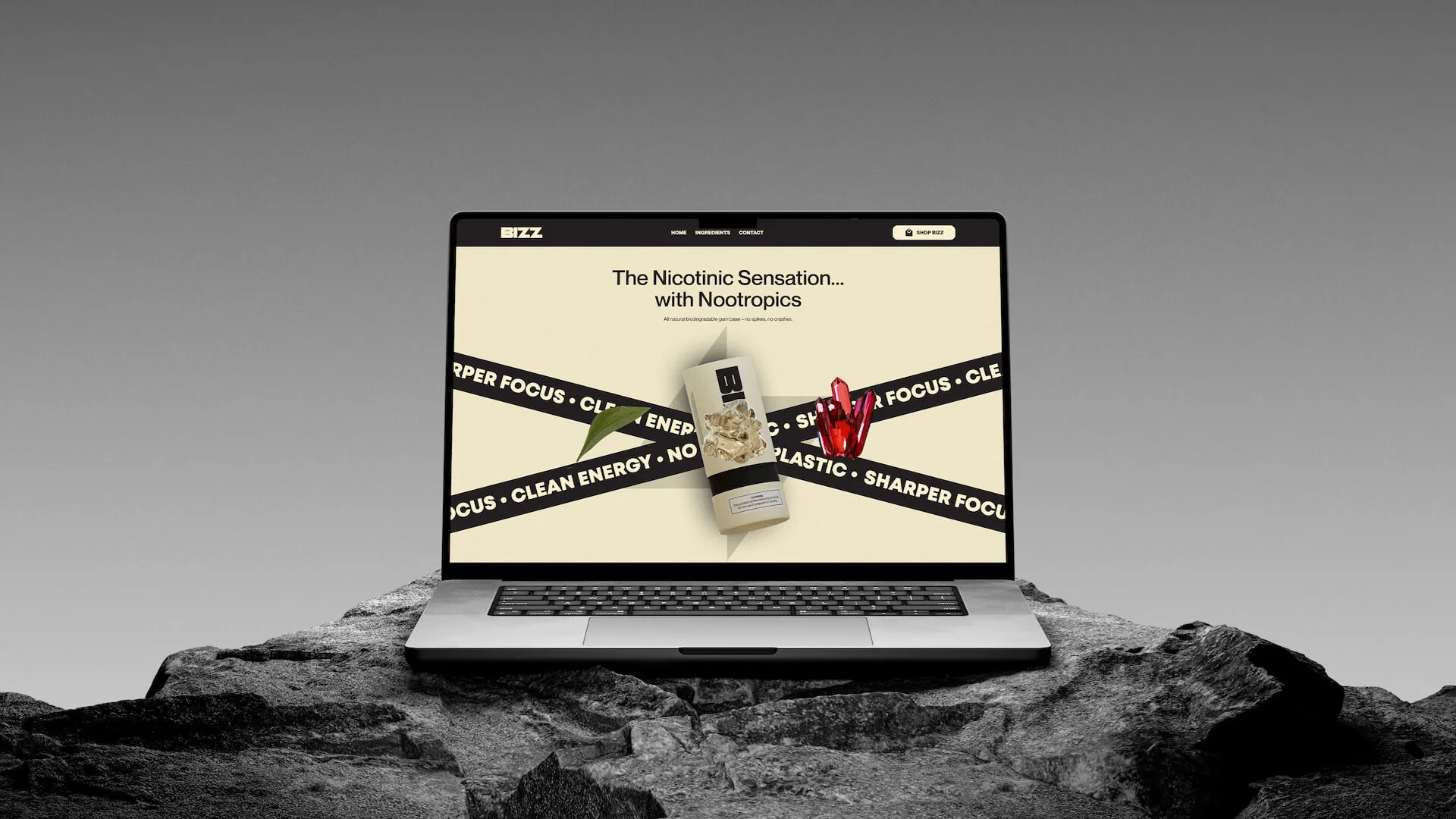
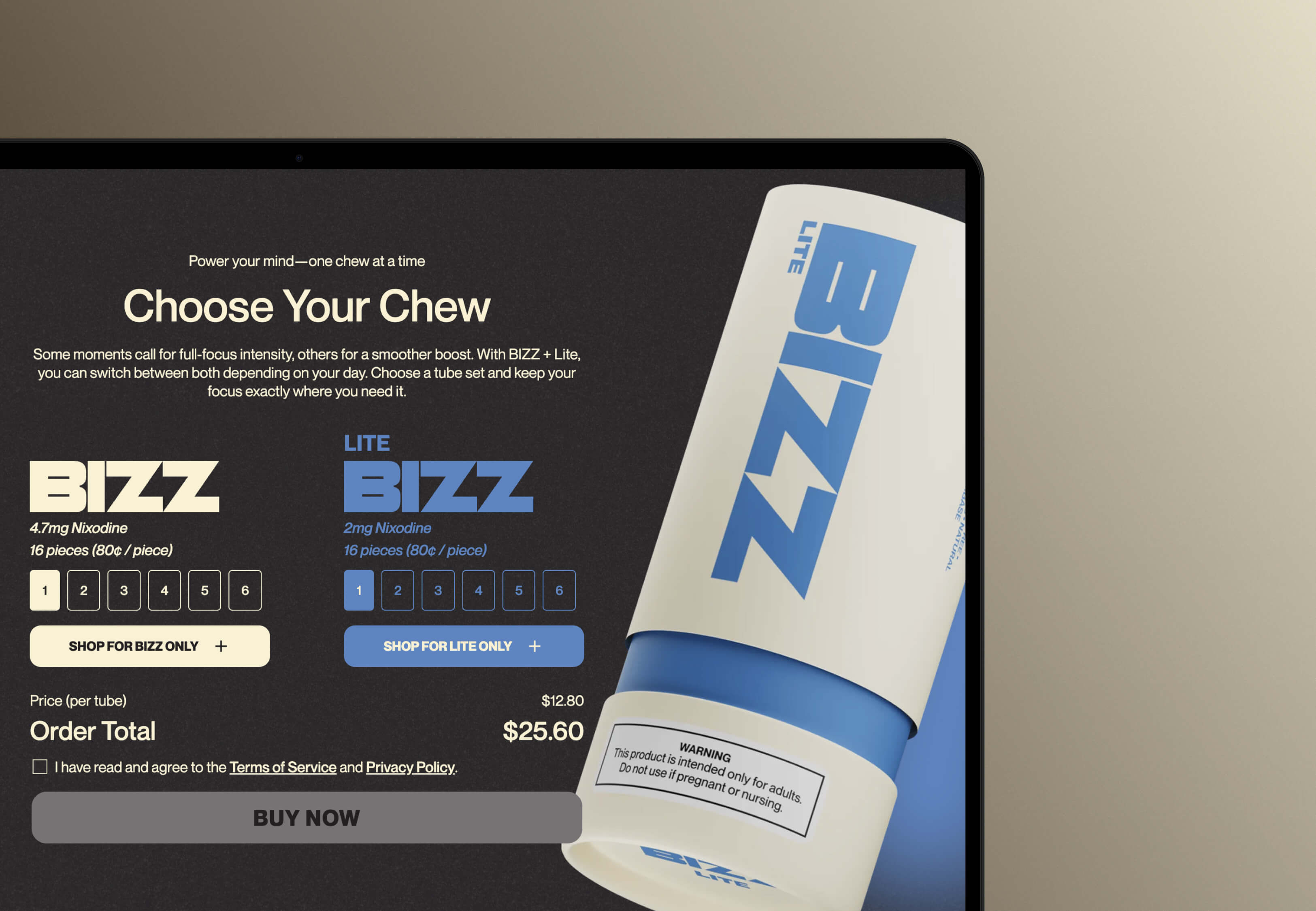
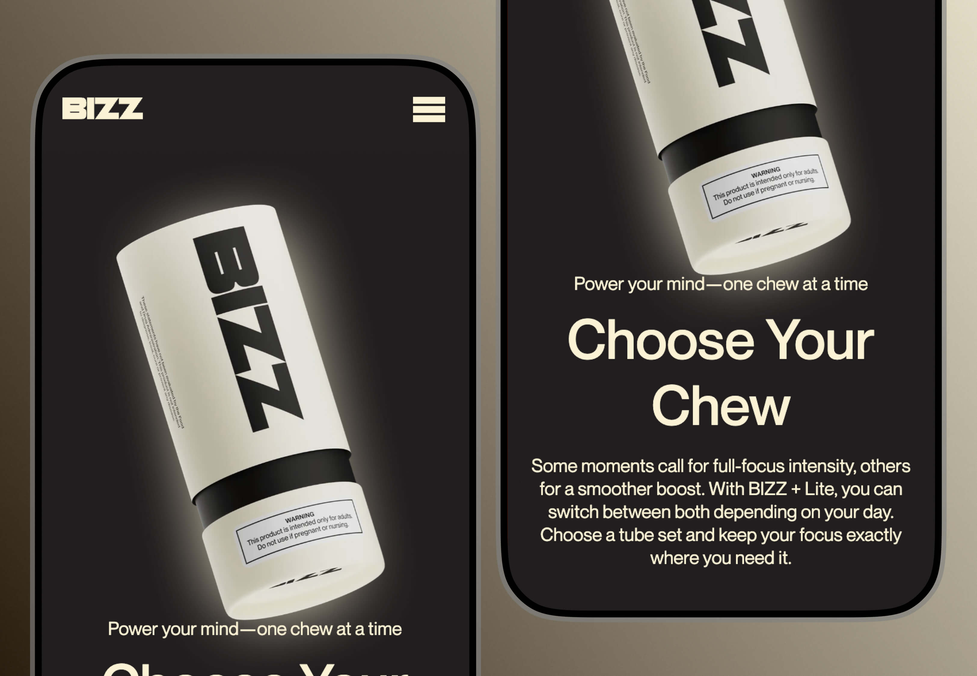
We designed two environments, one for BIZZ and one for LITE, each built as a visual metaphor for how that formula actually feels. Flavor rooms, in effect, giving the product spatial presence in the browser rather than parking it on a shelf. The 3D came out of Blender and shipped as pre-rendered imagery, video, and Lottie animations instead of live in-browser models, which let us keep the visuals cinematic while keeping the page light. Every asset was built against a mobile performance budget from day one: compressed, optimised, loaded only when needed, so Core Web Vitals stayed protected on the product pages.
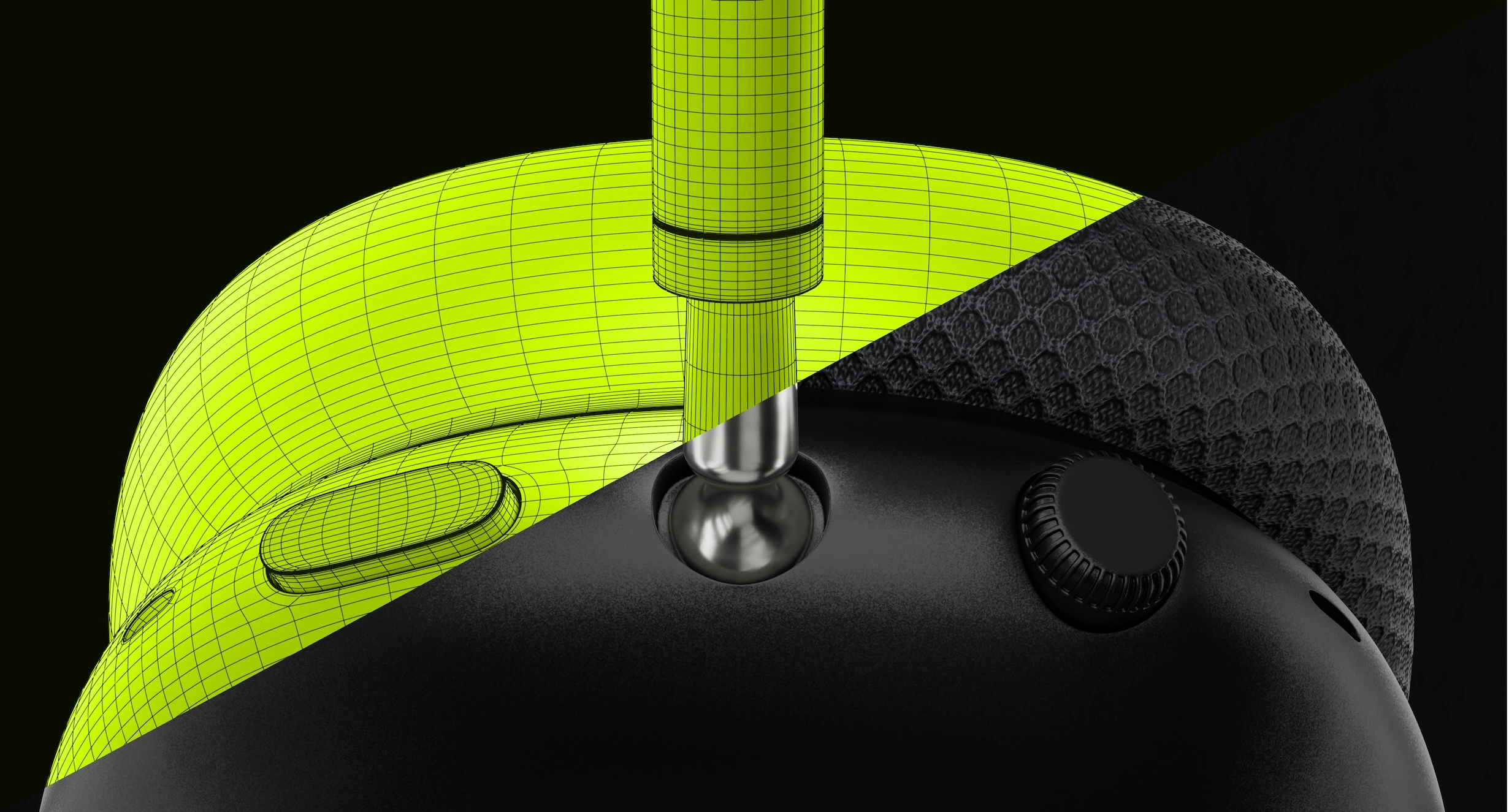
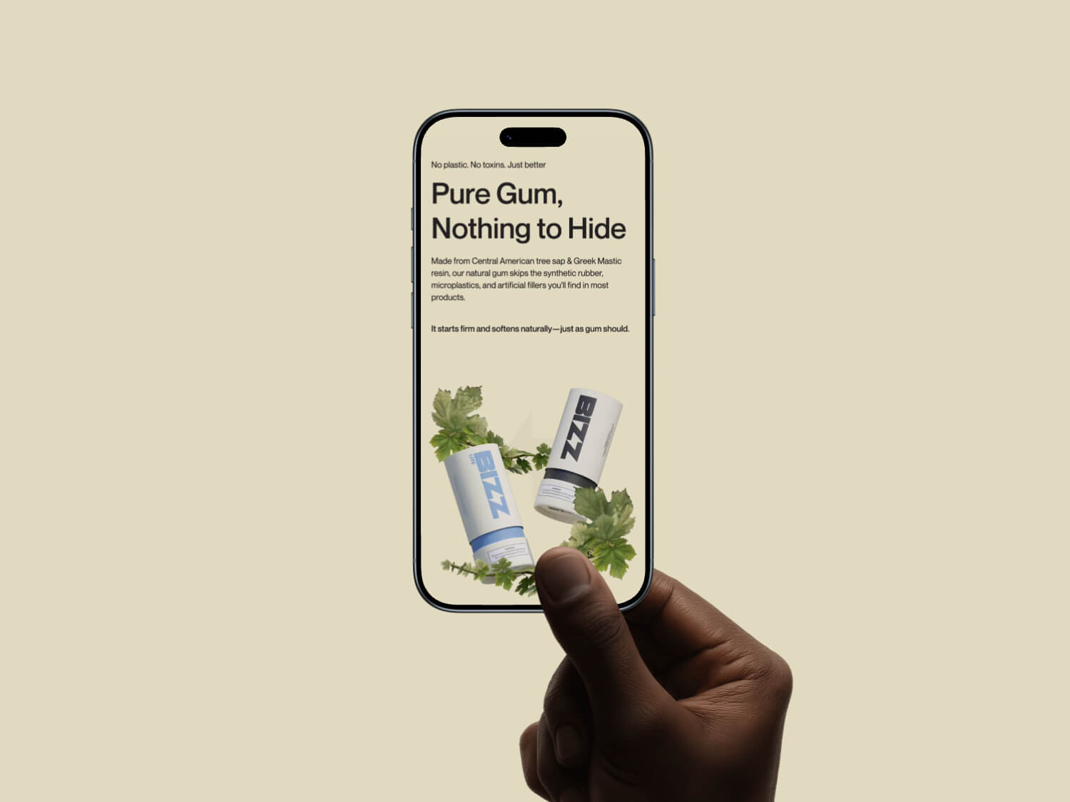
The 3D didn't stop at the rooms. It went down to the individual product moment. Photorealistic ingredient renders showed the formula's transparency in a single frame where a clinical spec panel would have killed the mood outright. Floating pack animations tracked scroll position. Layered motion sequences walked the story from problem to product to purchase. Nothing on the page moved by accident.
Scroll and stagger choreography, built in Webflow, carried the arc between the immersive sections and the ingredient-transparency content. The design system kept the rendered environments and the Webflow layout layer visually continuous, so crossing from one to the other read as a single product rather than two builds taped together.
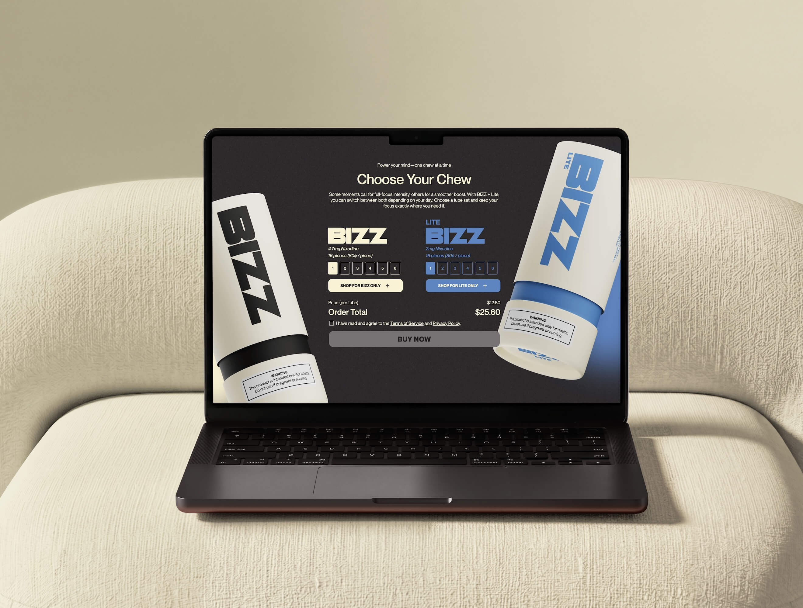
The Shopify side existed to protect that continuity straight through checkout. Custom product components inside the Webflow environment pulled live inventory from Shopify's Storefront API, so add-to-cart and checkout both fired inside the BIZZ brand context. Skipping the standard embed entirely kept the visual system intact at the exact point where buyers usually drop, and turned the checkout into a designed part of the experience instead of a stock template bolted on at the finish.
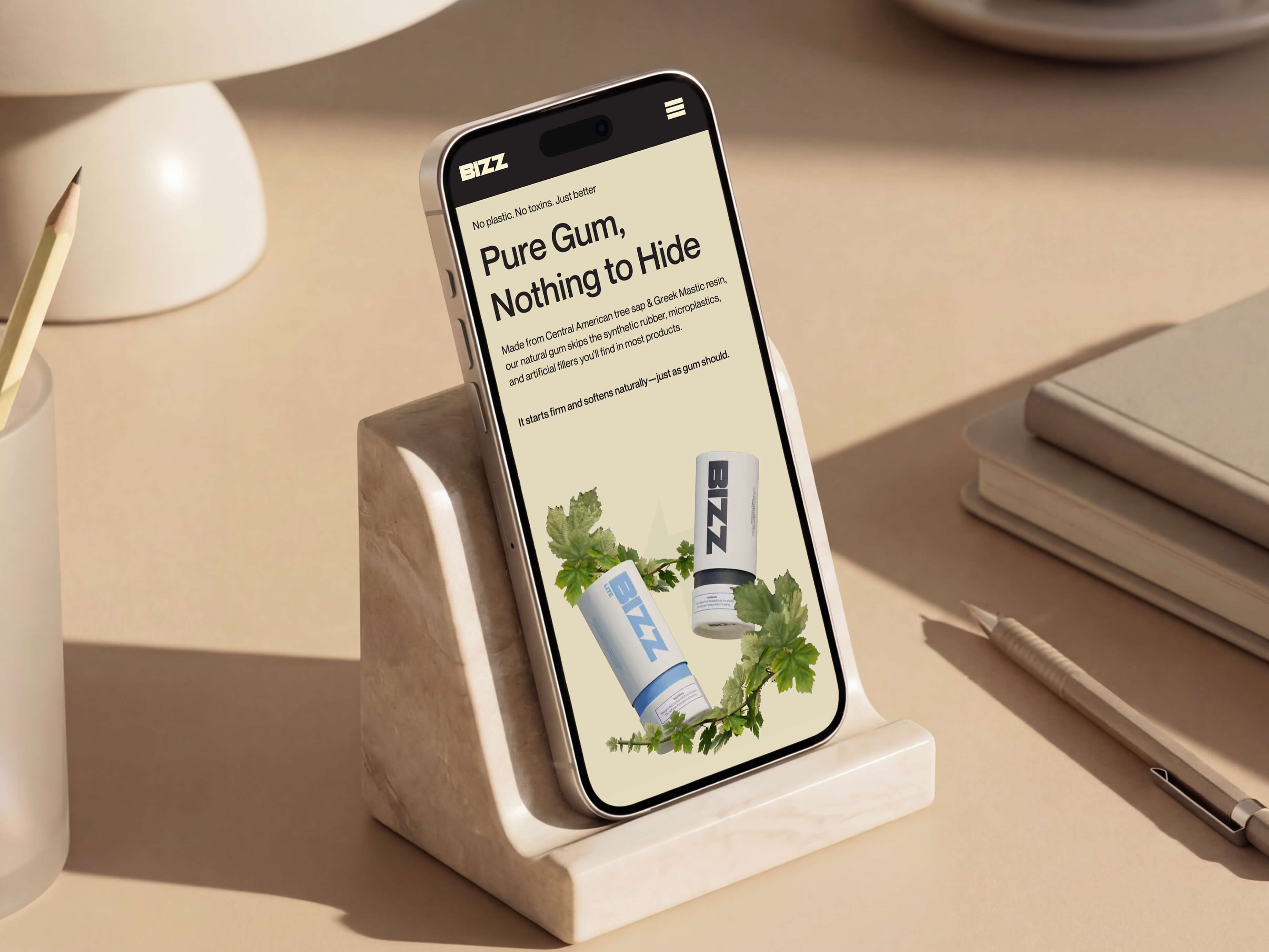
The site finally matched the product behind it. Those immersive environments handed BIZZ a visual language that nothing else in the nicotine category has, and parked it firmly among premium consumer goods, well off the pharmaceutical shelf. Visitors met it first as an object with presence and character, and only after that as a thing to buy.
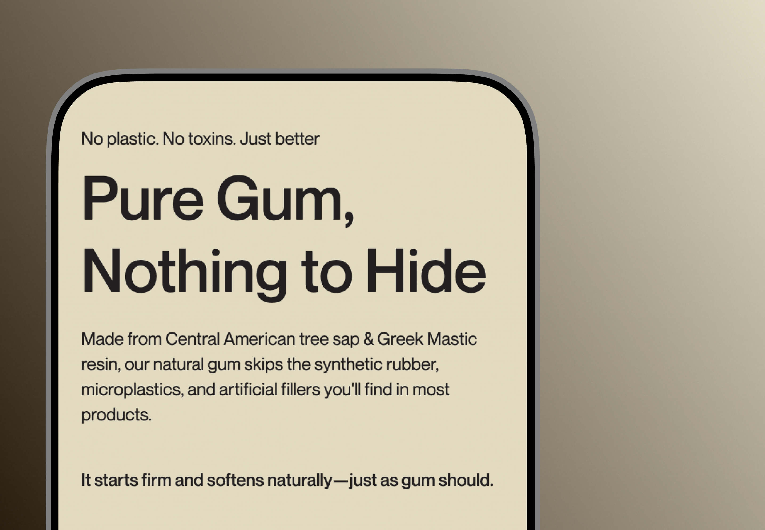
The transparency architecture, built on cinematic renders rather than spec sheets, answered the credibility question while keeping clinical language off the page. People worked out what made BIZZ different by exploring the visuals, which cut the mental friction of a careful purchase in a category where doubt is the starting position. The Shopify integration held the brand together through the purchase path and erased the experiential break that normally shows up right at the highest drop-off point. On mobile, the rendered environments came in under acceptable LCP thresholds and the checkout tested clean of conversion-impacting friction.
.jpg)




34,1%
Conversion Rate from qualified traffic
vs 10% Industry Standard
33Min
Average Session Duration
vs 10Min Industry Standard
7
Ingredients Renders
visualized in 3D
6
Deliverable Layers
concept, UX, 3D environments, ingredient renders, interactive animations, and commerce integration.
Post-launch average across e-commerce rebuilds in the first quarter.
Post-launch average across e-commerce rebuilds in the first quarter.
Post-launch average across e-commerce rebuilds in the first quarter.
Post-launch average across e-commerce rebuilds in the first quarter.
Webflow is the correct platform for this type of build when the architecture is designed correctly. The 3D layer runs as a WebGL canvas integrated into the Webflow layout, with Shopify handling commerce infrastructure via Storefront API integration. Webflow manages the content layer, editorial control, and CMS-driven content updates. The result is a fully custom e-commerce experience with editorial flexibility that doesn't require an engineering ticket for every content change. The platform serves the build well at this scale; the constraint is the architectural approach, not the platform's capability.
A 3D product visualisation built with performance discipline adds approximately 400 to 900 kilobytes of compressed asset weight to a product page and requires a deferred loading architecture to avoid impacting LCP. On a well-built scene, Core Web Vitals scores remain within passing thresholds on mobile. The trade-off is real but manageable: the additional load is offset by increases in session duration and conversion rate that consistently outperform flat-image product pages in premium consumer categories where the purchase decision involves visual inspection.
The standard Webflow-to-Shopify embed renders Shopify's native checkout UI inside a Webflow page, which creates a visual discontinuity at the highest-stakes point in the purchase path. The alternative is a custom integration using Shopify's Storefront API, which allows product data, cart management, and checkout initiation to be surfaced through custom components built inside the Webflow design system. This approach requires full-stack engineering capability rather than a standard embed, but it preserves the brand experience through to conversion and eliminates the aesthetic break that causes drop-off.
BIZZ had something genuinely different to sell. Our job was making the website say so, loudly enough to be believed. When a product earns premium and the digital presence hasn't caught up, that gap is exactly what we close.


A few details about the project is enough to get the conversation started.



Fueling Brands.
%20(1).svg)