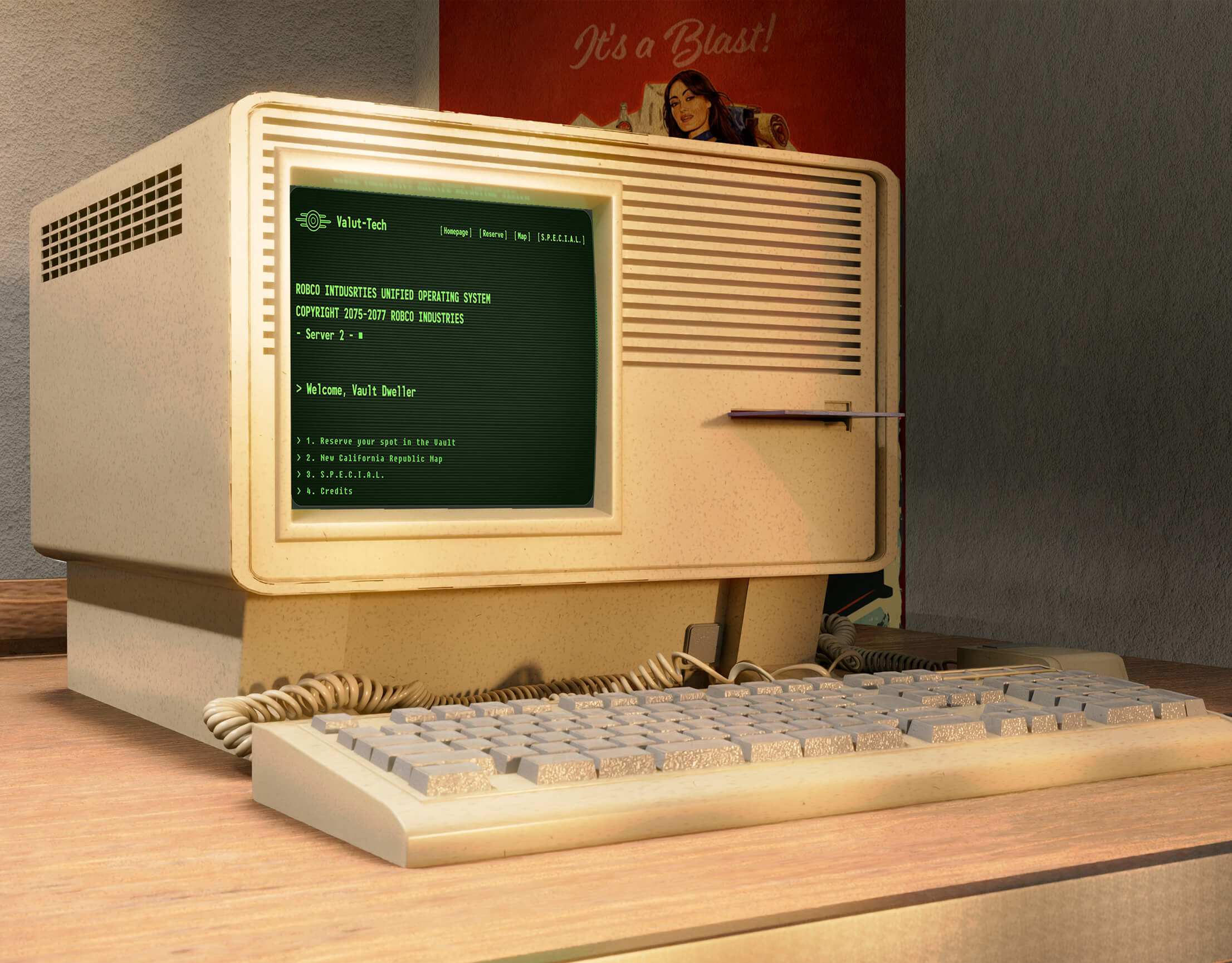
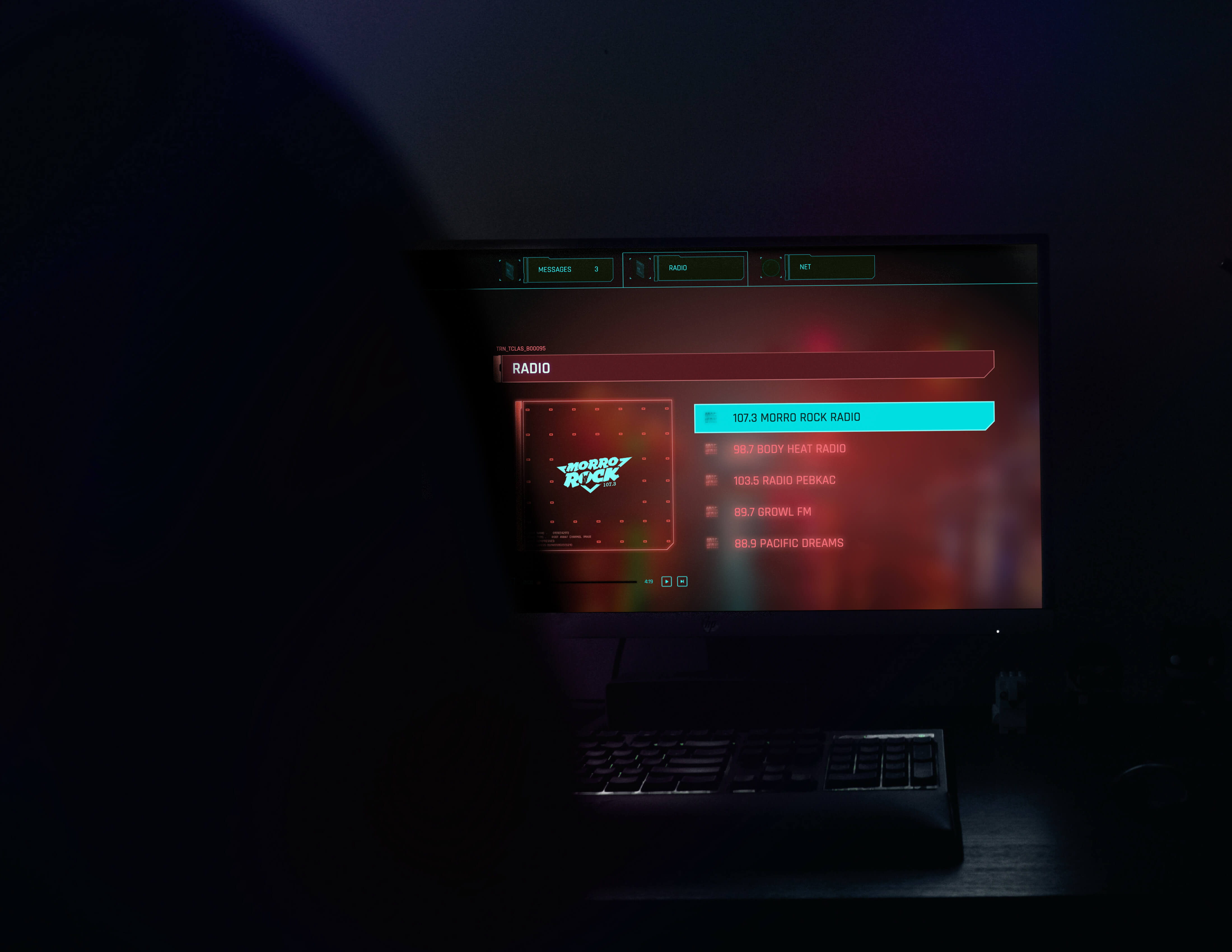
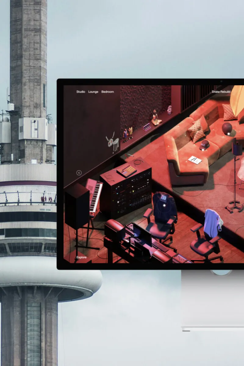
Drake Related is one of the strangest commerce experiences online, in the best way: an explorable 3D house where you wander through rooms and shop whatever's sitting inside them. The décor is the catalogue. We rebuilt it in Webflow, room for room, same isometric look, same hover-to-shop interactions, same explorable feel, on a platform nobody would ever pick for a job like this.
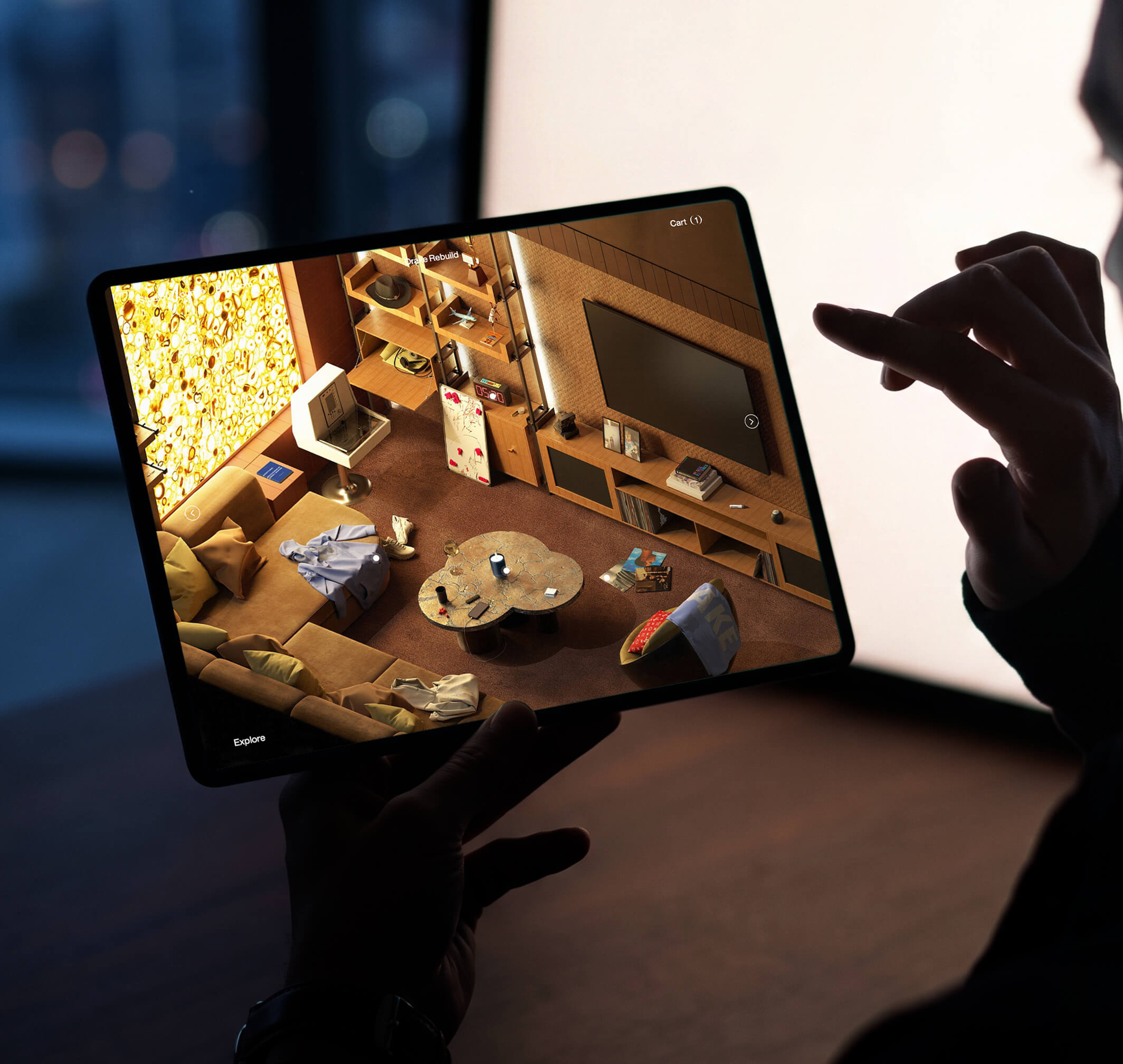
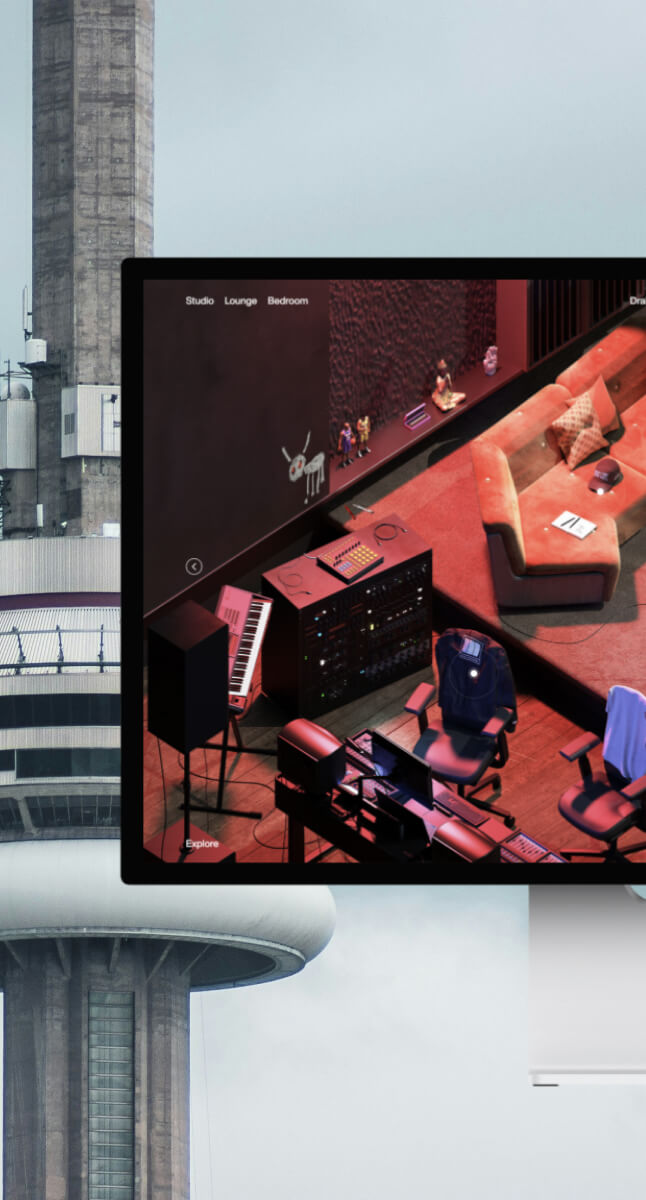
Drake Related is one of the strangest commerce experiences online, in the best way: an explorable 3D house where you wander through rooms and shop whatever's sitting inside them. The décor is the catalogue. We rebuilt it in Webflow, room for room, same isometric look, same hover-to-shop interactions, same explorable feel, on a platform nobody would ever pick for a job like this.
This one was for us. We wanted to find our own ceiling, not serve a client, and we measured the result against the original with no mercy. Three rooms, every object mapped to a live product, the whole thing shipped on Webflow Ecommerce.
drakerelated.com sets a high bar. Cinematic isometric rooms, atmospheric lighting, objects you find by exploring rather than scrolling. The official site builds that world out of pre-rendered isometric imagery instead of a live engine, which happens to be exactly the technique we live in. So the question was simple to state and hard to answer: could we hit that quality on Webflow, a platform no one connects to immersive commerce, and have the result survive a side-by-side with the source.
Three things had to land at once. The look, with rooms, lighting, and composition reproduced to the source standard. The interface, translating a spatial, game-like way of moving through a space into something that behaves on a standard web stack yet still feels like a place you step into. And the seam between exploring a room and buying an object, joined so cleanly that the join never shows.
The room art copies the original's method. Pre-rendered isometric scenes, interactive hotspots dropped precisely onto the objects. That keeps every room at full cinematic quality on any device, loading fast, holding each product exactly where the composition put it.
We split the experience deliberately. Rooms stay dark and atmospheric, doing the work of pulling you in and building the want. Tap an object and the scene drops away to a clean, bright product page. The original draws that same line between discovery and purchase, and we kept it. One surface seduces, the other sells, and neither blurs into the other.
The store itself is plain native Webflow Ecommerce. That was the point. Let the expressive layer chase atmosphere all it wants, and let cart, product pages, quantities, and checkout sit on infrastructure that already knows how to do the boring, critical parts. Spend the effort where a visitor will see it. Leave the plumbing alone.
A fully shoppable world. Three rooms to explore, every object clickable, every click hooked to a working store.
We rebuilt one of the web's most distinctive commerce experiences to find out whether the technique survives the move to Webflow. It does. And it's ready the day a product deserves a space to be explored instead of a page to be scrolled.

A few details about the project is enough to get the conversation started.



Fueling Brands.
%20(1).svg)